the flying
horse pub
→
company
beds and bars
→
industry
hospitality and entertainment
the flying
horse pub
→
company
beds and bars
→
industry
hospitality and entertainment
→
context
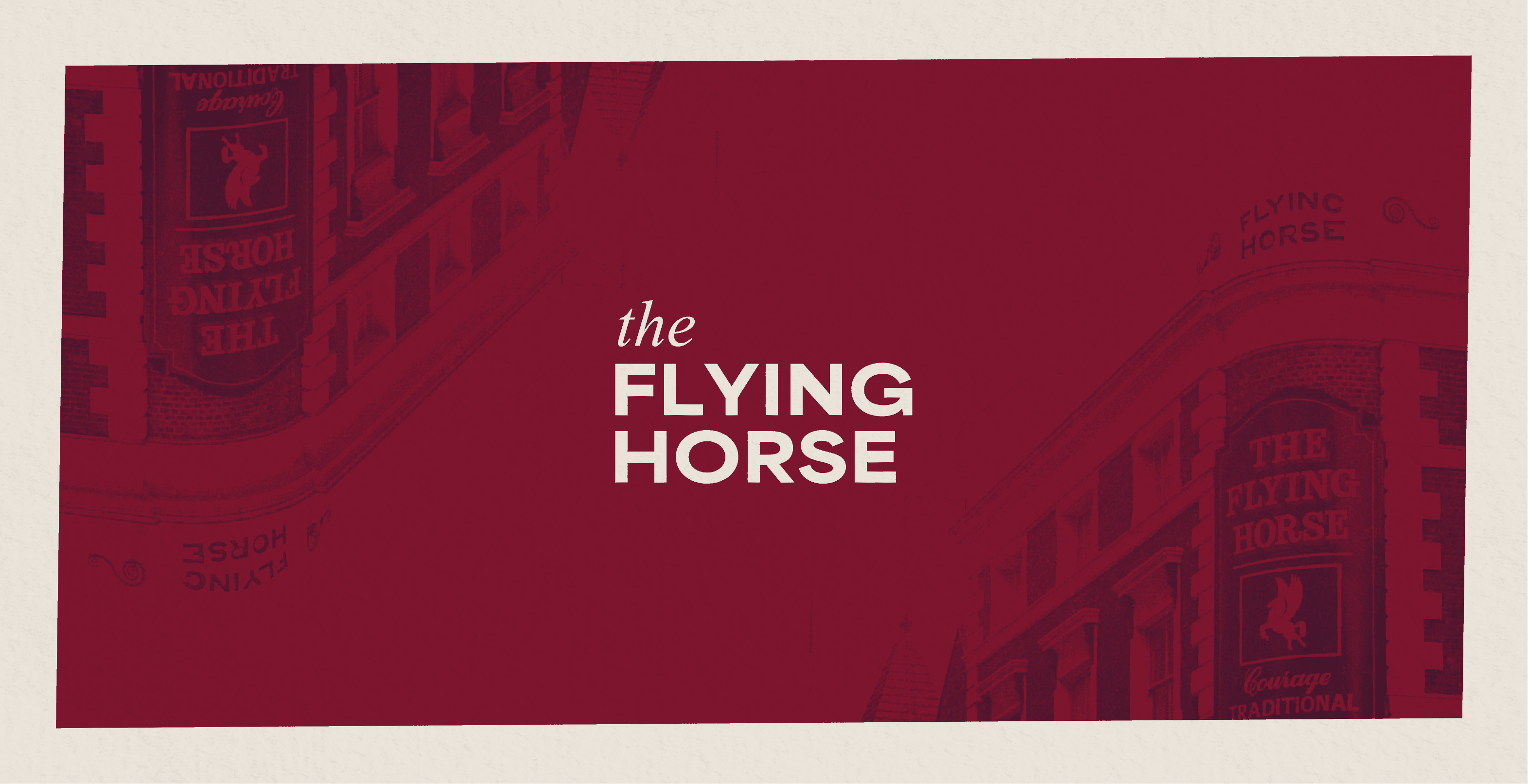
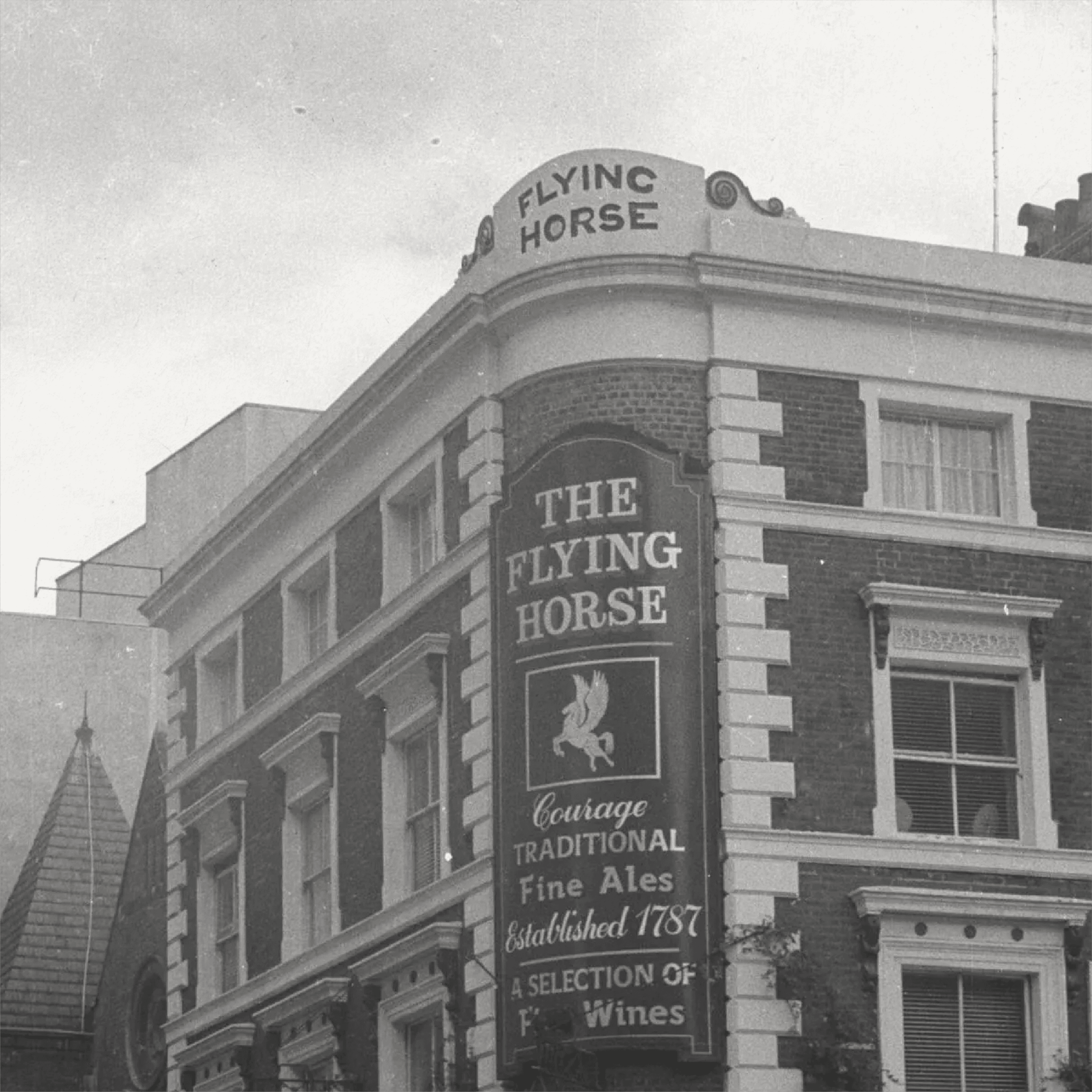
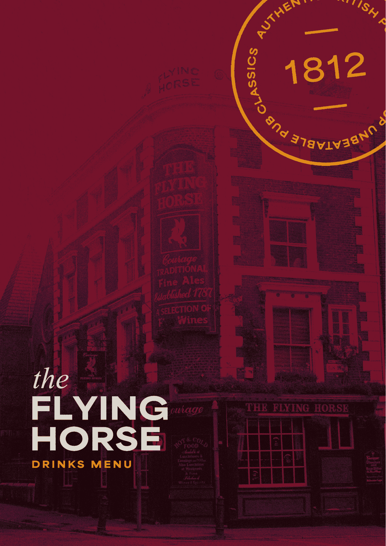
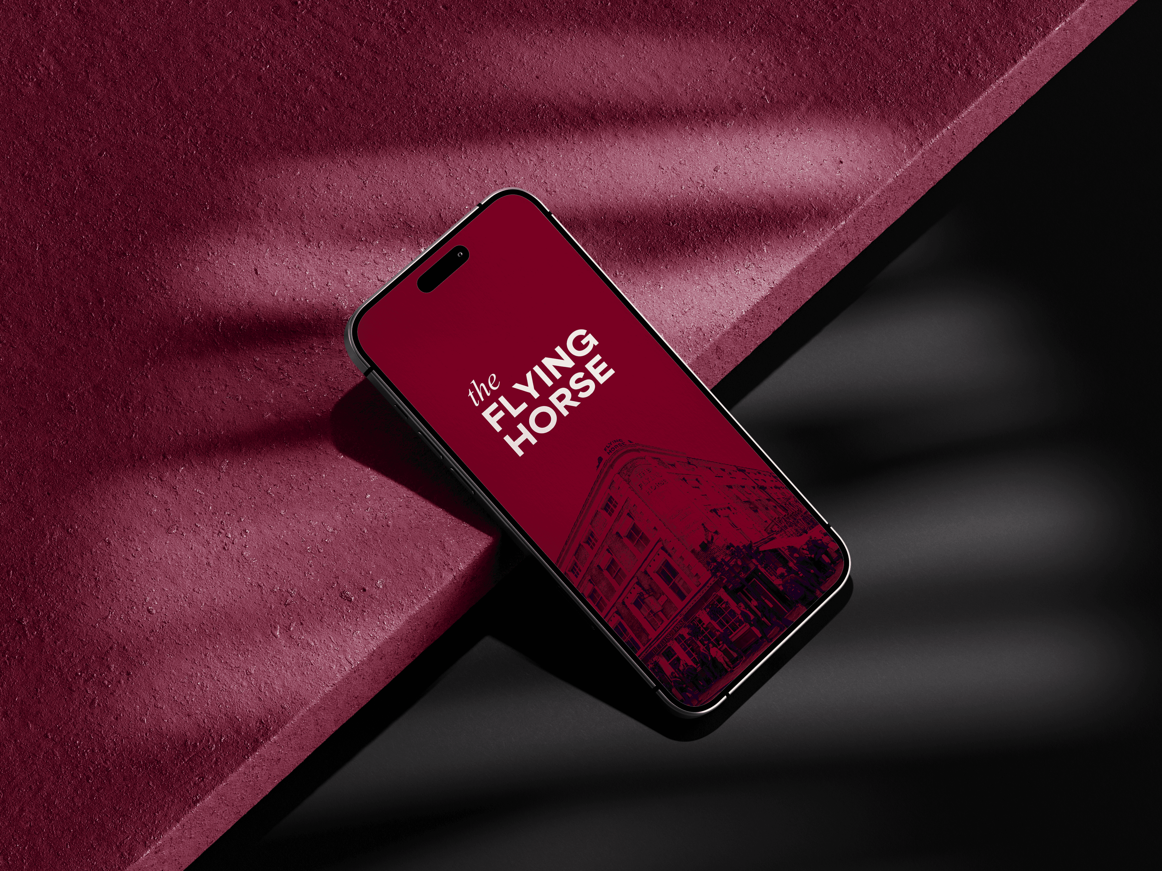
the flying horse is a historic british pub positioned within a competitive hospitality landscape. with a strong architectural presence and heritage background, the brand needed a visual identity that respected its history while appealing to a modern audience.
the existing materials lacked cohesion and did not fully reflect the pub’s character or commercial ambition. the challenge was to refine the brand into a more confident, elevated identity that balanced tradition with contemporary relevance.
→
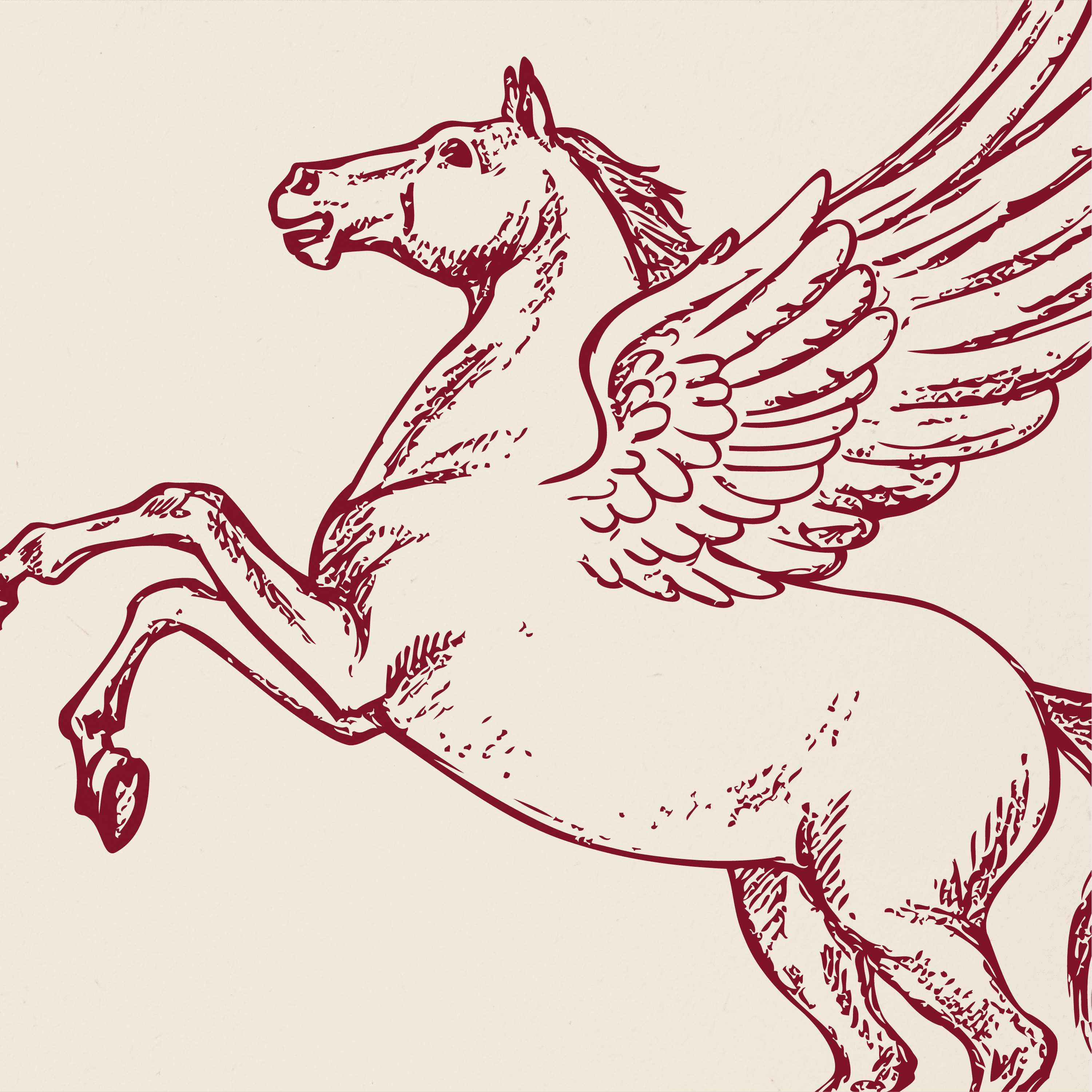
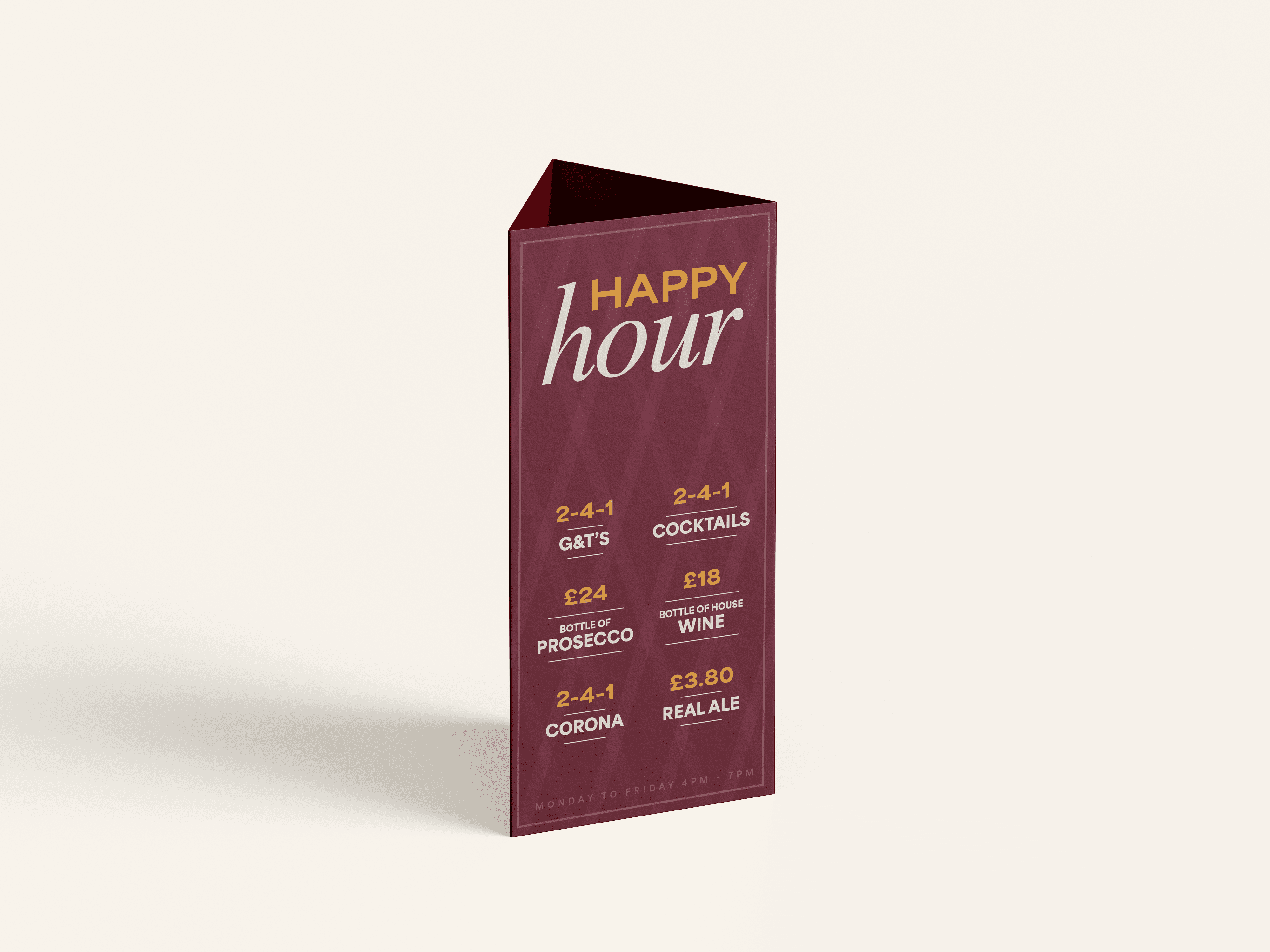
system & impact
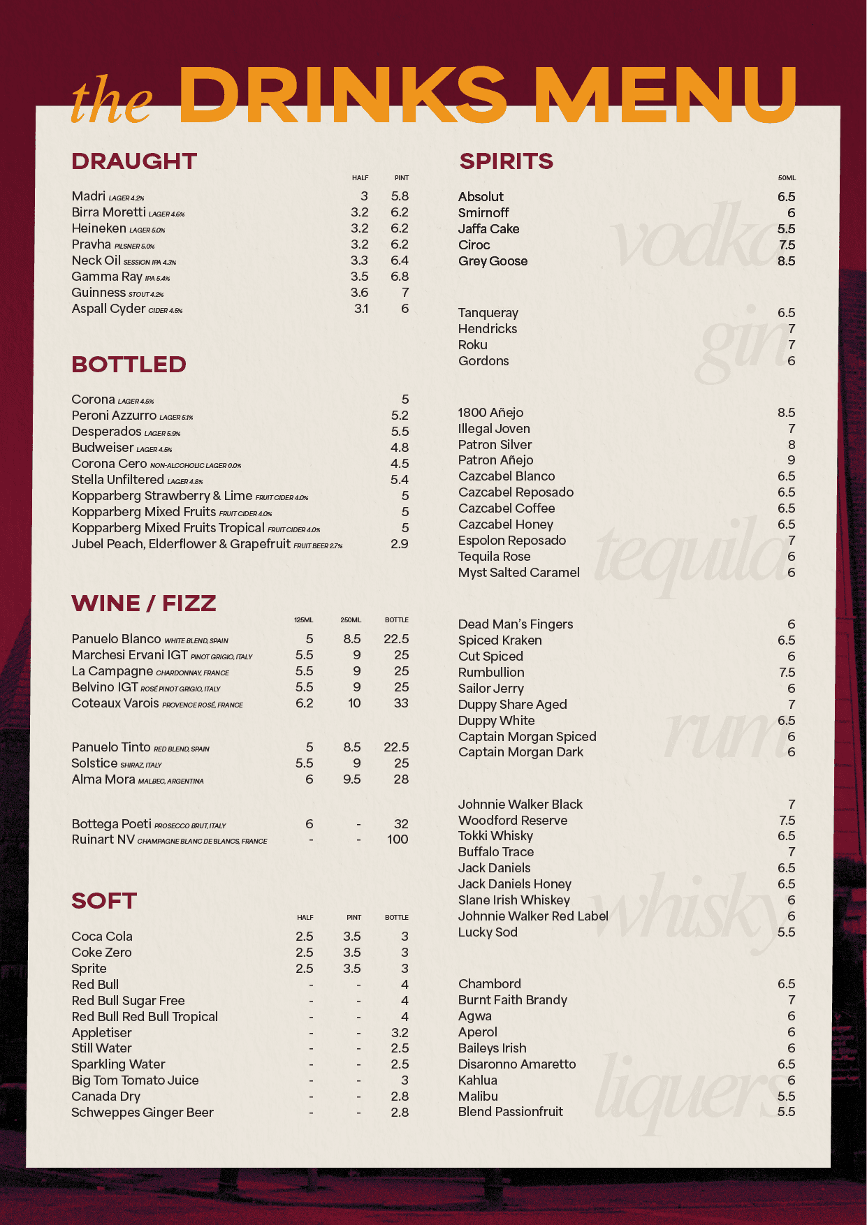
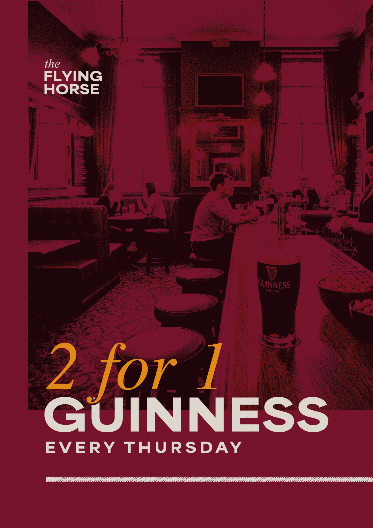
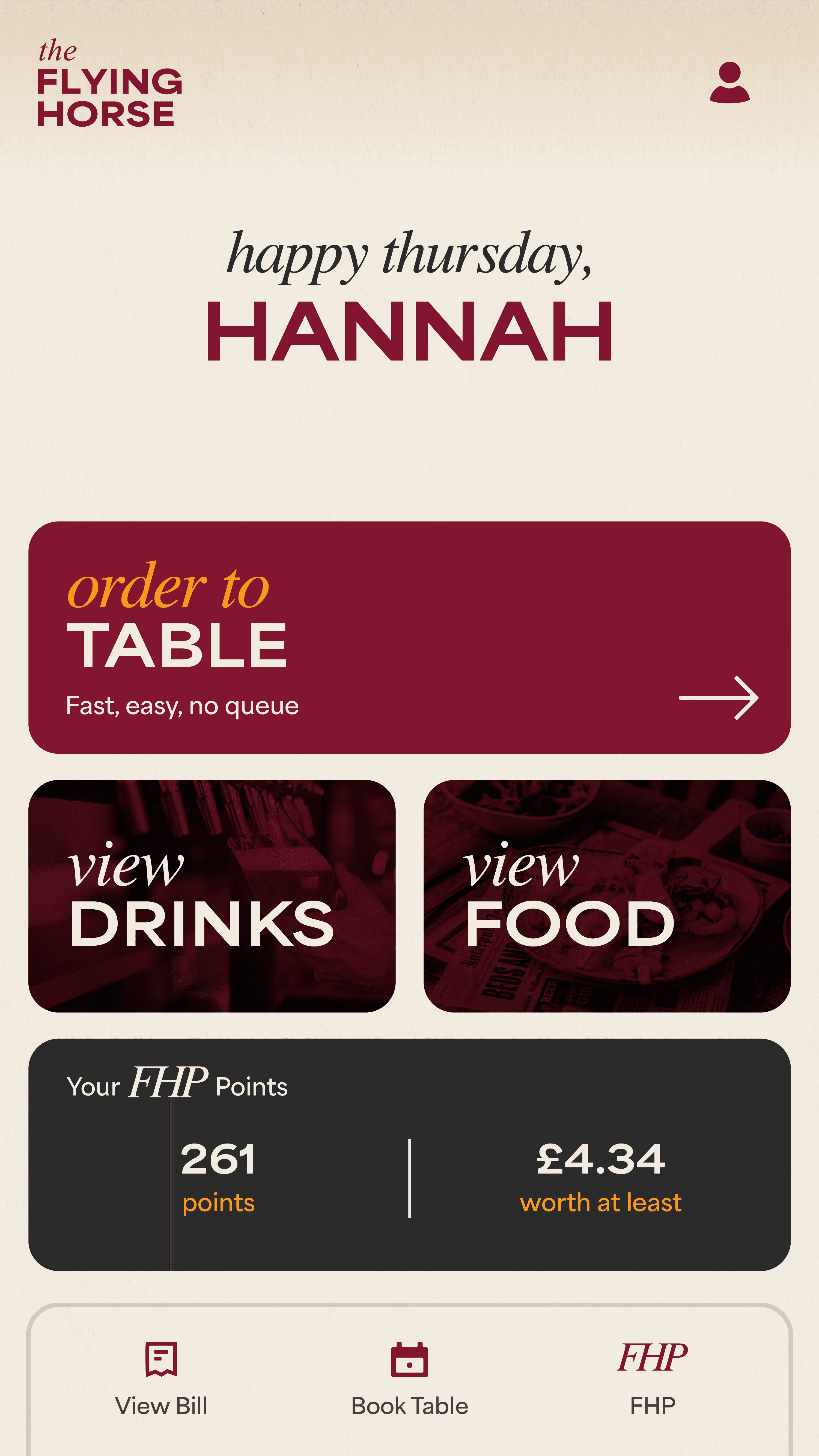
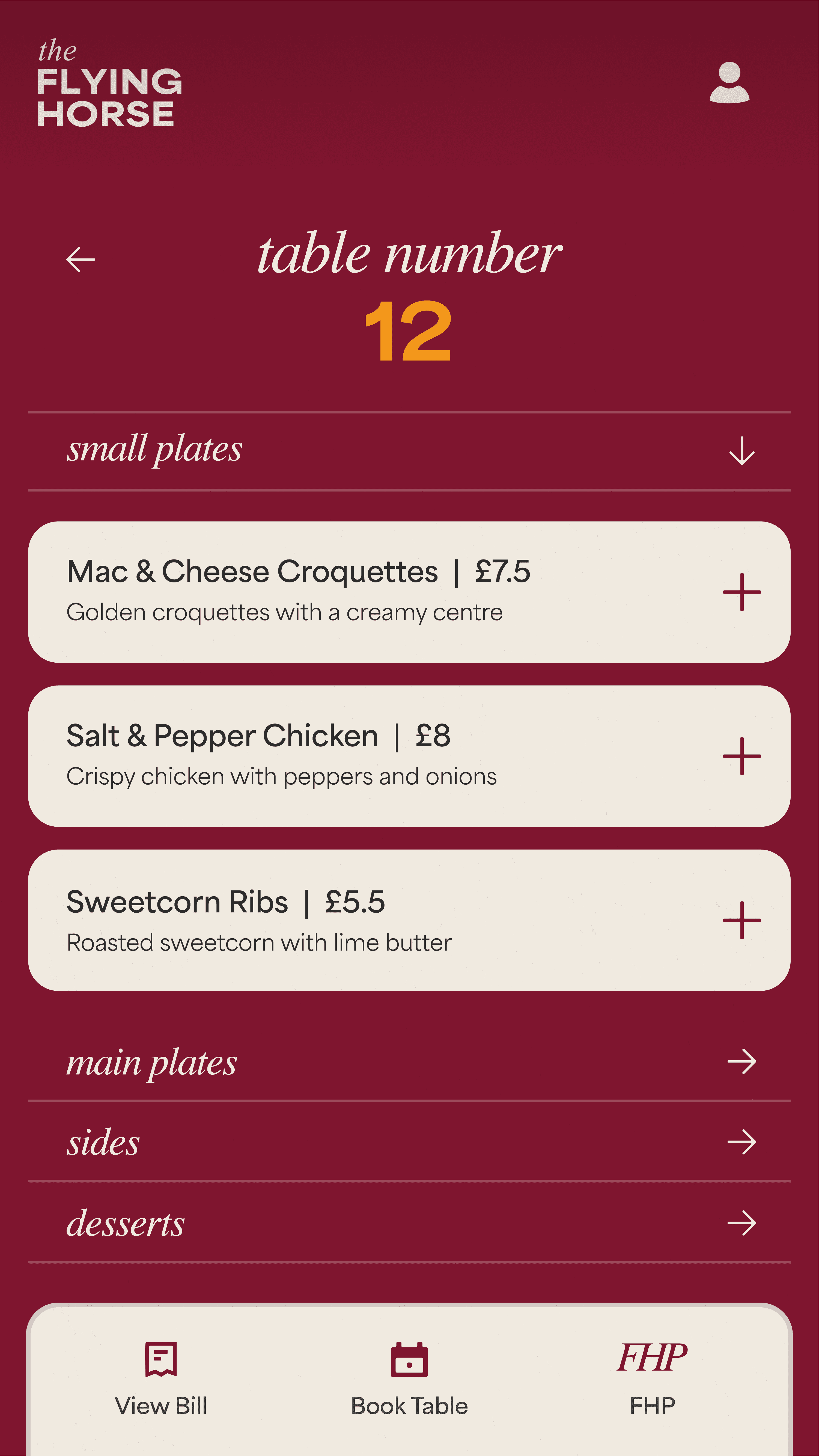
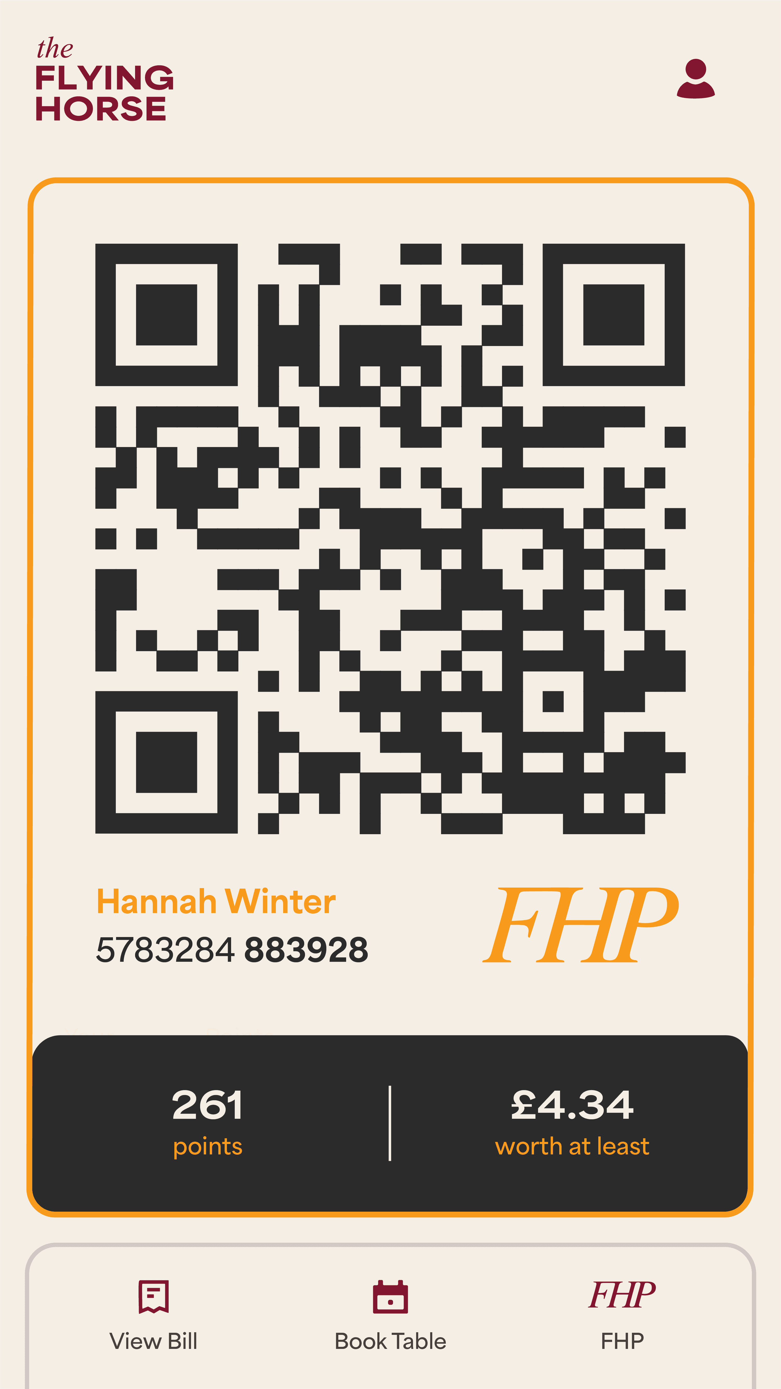
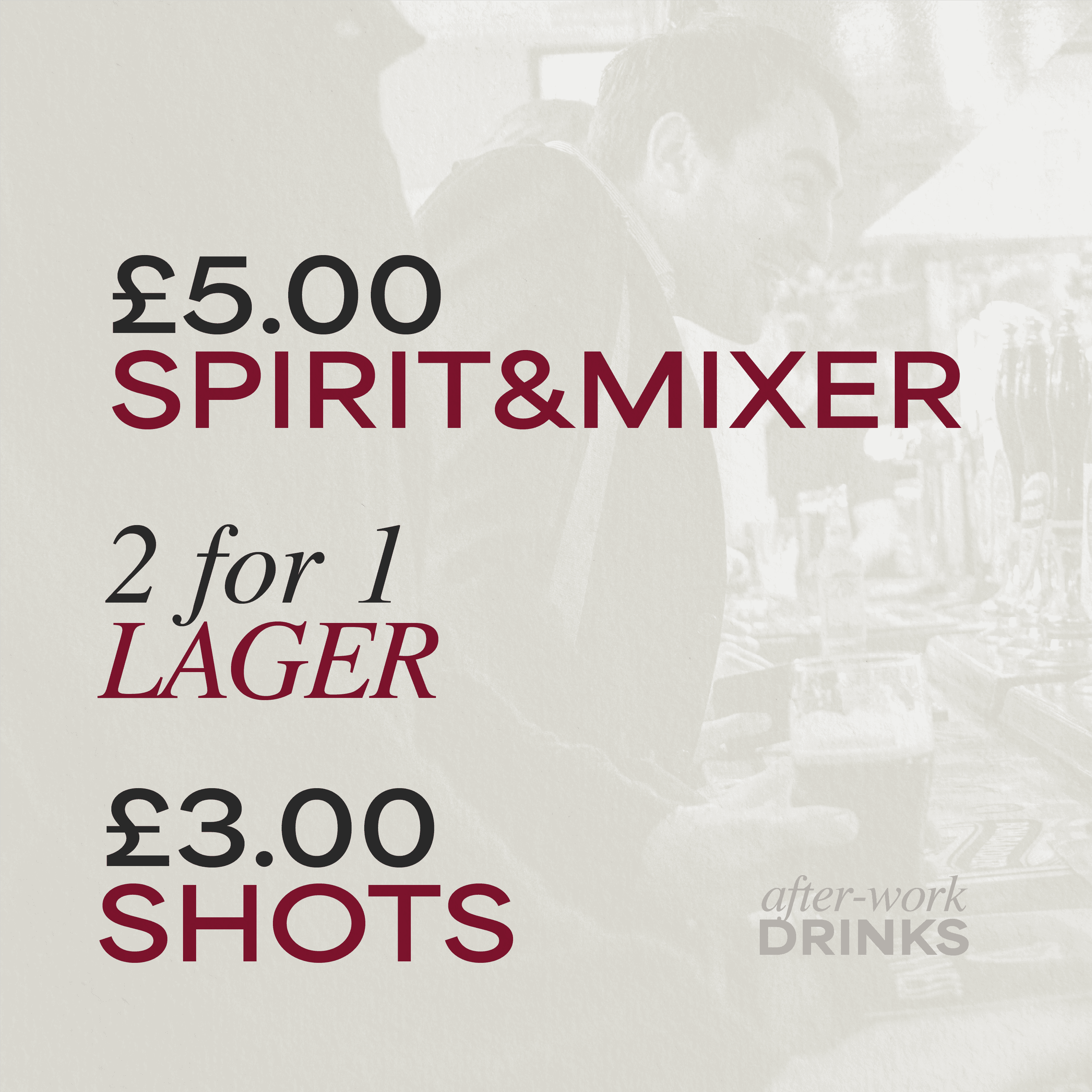
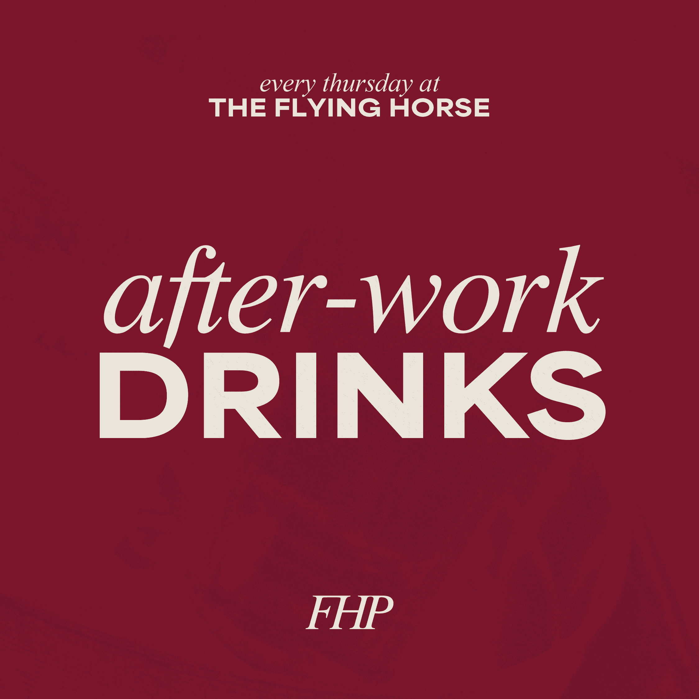
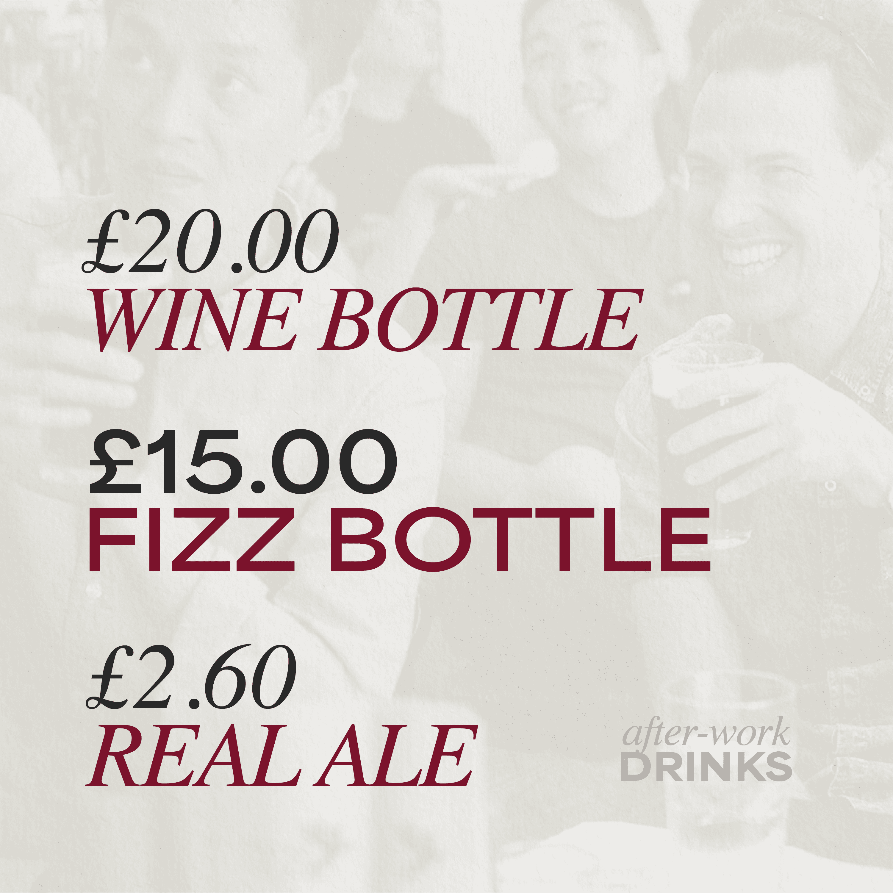
I developed a refined visual system rooted in heritage cues and inspired by the deep maroon tones of the building itself. restrained typography, a rich red palette and structured layouts brought clarity and consistency across menus, signage and promotional materials, elevating the brand within a wider hospitality portfolio.
alongside this, I contributed to the rollout of mobile ordering across the group, including FHP, a shared loyalty system designed to work seamlessly across multiple venues. I led the visual design of the app and loyalty experience, creating a cohesive ecosystem that strengthened retention and scaled beyond a single site.
→ context
the flying horse is a historic british pub positioned within a competitive hospitality landscape. with a strong architectural presence and heritage background, the brand needed a visual identity that respected its history while appealing to a modern audience.
the existing materials lacked cohesion and did not fully reflect the pub’s character or commercial ambition. the challenge was to refine the brand into a more confident, elevated identity that balanced tradition with contemporary relevance.
→ system & impact
I developed a considered visual system rooted in heritage cues but executed with modern clarity. typography was refined to feel classic yet restrained, supported by a muted, premium palette and structured layouts that brought consistency across menus, signage, and promotional materials.
the result is a more cohesive and elevated brand presence that strengthens the pub’s identity, enhances customer perception, and provides a scalable framework for future seasonal campaigns and in venue communications.